Guidelines
The logo and the combination of the logotype form a visual symbol of Oando – our corporate signature. It therefore needs to be clear and prominent in order to ensure maximum exposure. To this end, specifications of dimension, placement and clear space surrounding the logo have been established. The logo and logotype may be used independently, but when applying them as our primary signature, it is important to ensure that all the elements work consistently in relation with each other.
Horizontal Format Structure
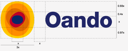
Horizontal Format Grid
Horizontal Format Grid
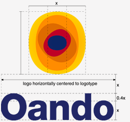
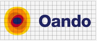
Descriptor system and clear space requirements
Clear space: In order to achieve maximum exposure for our corporate signature, it is important to allow a sufficient parameter of space around the collective elements. This specification of a ‘frame’ or clear space surrounding our identity ensures clarity and legibility of our corporate signature throughout all applications. It can be determined by a 1 X-indicating frame around the full parameter of the corporate signature or around the individual elements. It is even more essential to ensure a perimeter of space around the stacked signature, as the elements have already been altered in their combined structure.
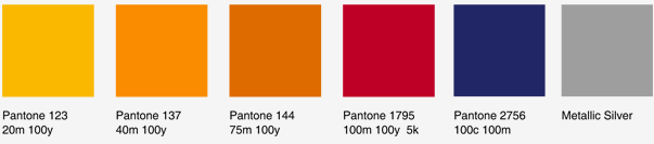
Color Palete
Our corporate colour palette was specially chosen to reinforce the image and energy of the Oando identity. It is an intrinsic part of our corporate signature, both through colour and intensity and is as important as the graphic elements and requires the same consistency throughout. It is therefore essential that the specifications be adhered to both in terms of hues and tones. Keep to the authorised colours specified on this page as they would appear across the various applications and don’t substitute them for any variations. Consistent application of the colour system is essential for the establishment of a distinctive visual language for Oando.
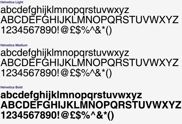
Typeface
Helvetica has been selected for its clean and easily legible form and its honest, open and approachable appeal. It compliments the identity with its simplicity, clarity and boldness. Its contemporary yet timeless character will ensure the identity does not date. Helvetica has many variants. Therefore, in order to maintain the consistency and strength of the identity, only the versions indicated in this manual are to be used. No other form of Helvetica is acceptable (i.e. condensed, extended, oblique, ultra kerning, etc.)
Color Controls
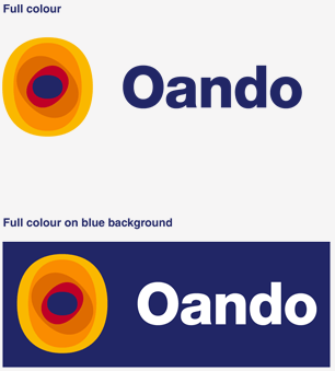
The preferred application is the full colour identity on a white background, as illustrated below. When a single colour application is necessary, the primary colour palette should be used. A two-colour application is acceptable, but discretion must be used to ensure sufficient contrast occurs and to avoid weakening the identity in any way.
One Colour

Two Colours

When reducing the logo, care must be taken not to lose definition. This depends largely on the printing process used and onto what material the logo is to be applied. The specifications set out on this page are intended only as guidelines and the user must use their discretion at all times. If it is necessary to reduce the logo further, then the sun device should be dropped and only the logotype should be used.
Full Colour Spot
Pantone inks are solid inks and will therefore retain more detail than process inks. The minimum size should not be smaller than 22mm.
Single colour: spot
Pantone inks are solid inks and will therefore retain more detail than process inks. The minimum size should not be smaller than 22mm.

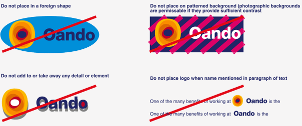
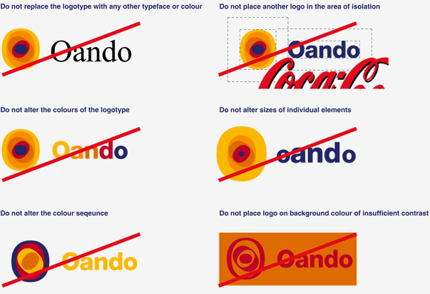
Incorrect Uses
It is essential that the identity never be altered in any way from the guidelines indicated in this section. Some examples of incorrect usage that would damage the image of the brand, are illustrated on this page